THE BRIEF
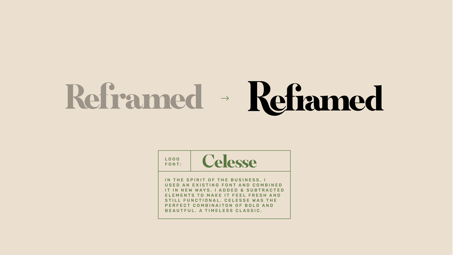
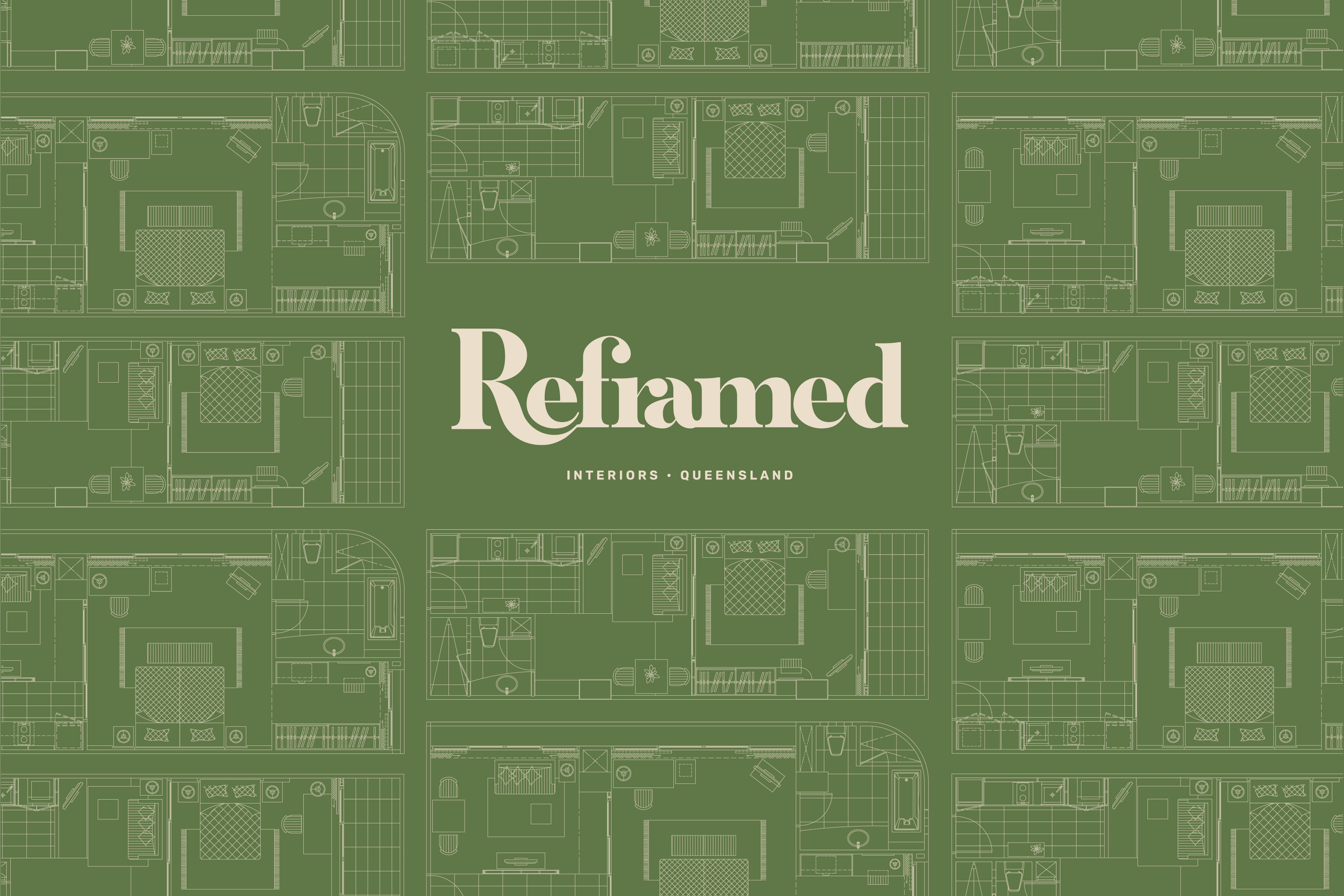
Reframed is a new kind of interiors business. Not only for those whose budgets can buy mansions worthy of Architectural Digest, Reframed has developed a smart system to help the more normal of us live in style. The logo needed to suggest re-thinking and re-use. It needed to feel timeless, sturdy, thoughtful and inventive, but still editorial. On trend, but not trendy. To achieve this, I used a classic serif font and rearranged and recombined it how one might with furniture in a room.
It’s a classic, reframed.


